CASE STUDY – VOYAGER SOPRIS LEARNING
CASE STUDY
Voyager Sopris Learning is part of the Cambium Learning® Group, a leading educational solutions and services company committed to helping all students reach their full potential. Voyager Sopris Learning provides innovative, evidence-based instructional solutions and professional development services to pre K-12 students and their teachers.
- Client: VOYAGER SOPRIS LEARNING
- Agency| Design: Clarity-Innovations
- Location: Portland, Oregon
- Software: Adobe Captivate, Photoshop, Illustrator and After Effects
- Project Link: http://www.voyagersopris.com/
VOYAGER SOPRIS: INTERACTIVE INSTRUCTIONAL VIDEOS
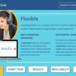
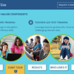
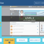
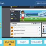
Texas based Voyager Sopris Learning engaged Clarity-Innovations to create fully interactive demo video tour that would assist their sales and marketing team to communicate the depth and capabilities of their LANGUAGE! Live blended learning solution. The ideas that users could also undertake a self-guided tour without any assistance.
The tour needed to combine a linear workflow with a modular architecture, so that presenters could pause the video at any time, or jump to any section from a given location in the demo.
I worked closely with our Art Director and Project Manager to first understand scope, timing, technical and brand requirements, audience and other variables. After analysis and consultation with the client, we decided to use Adobe Captivate to develop this demo. As much as possible, we wanted to use client supplied assets to more accurately reflect the actual product and branding as users would experience them. Much of these naturally didn’t conform to design specs for the demo, so a lot of work went into customizing them for this project. Other UI and graphic elements needed to be designed and built in-house by us.
The project scope and deliverables shifted several times during the development phase, but a strong collaborative approach allowed us to compensate quickly and keep on track. Ultimately, the client chose to remove some of the content in order to shorten and simplify the overall user experience. Because we built this in a flexible, modular fashion, we were able to make these changes and adapt very quickly without compromising quality or timing. Ultimately, the project was a success and can be accessed HERE and HERE.
